BYOMA Affirmation Cards

The Challenge
As a designer, I created affirmation cards that promoted the product while staying true to BYOMA’s brand. This included using their colour palette, developing a complementary illustration style, and selecting a cohesive typeface. My focus was on attracting the target audience and connecting with them through clear, engaging, and purposeful visuals.
The Process
The Colours: The colour palette is pulled directly from the products, keeping the visuals familiar and closely tied to what’s being promoted.
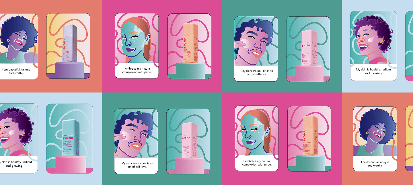
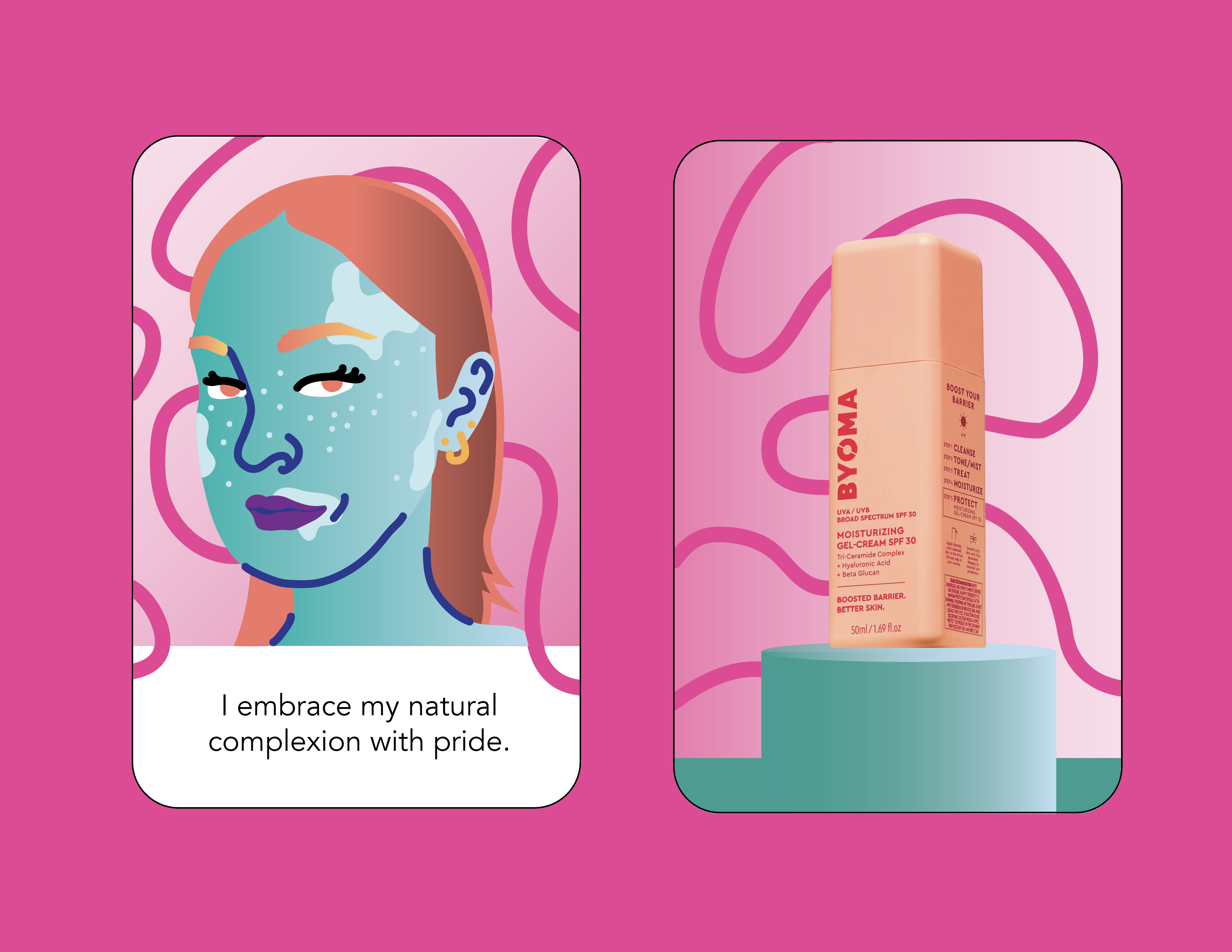
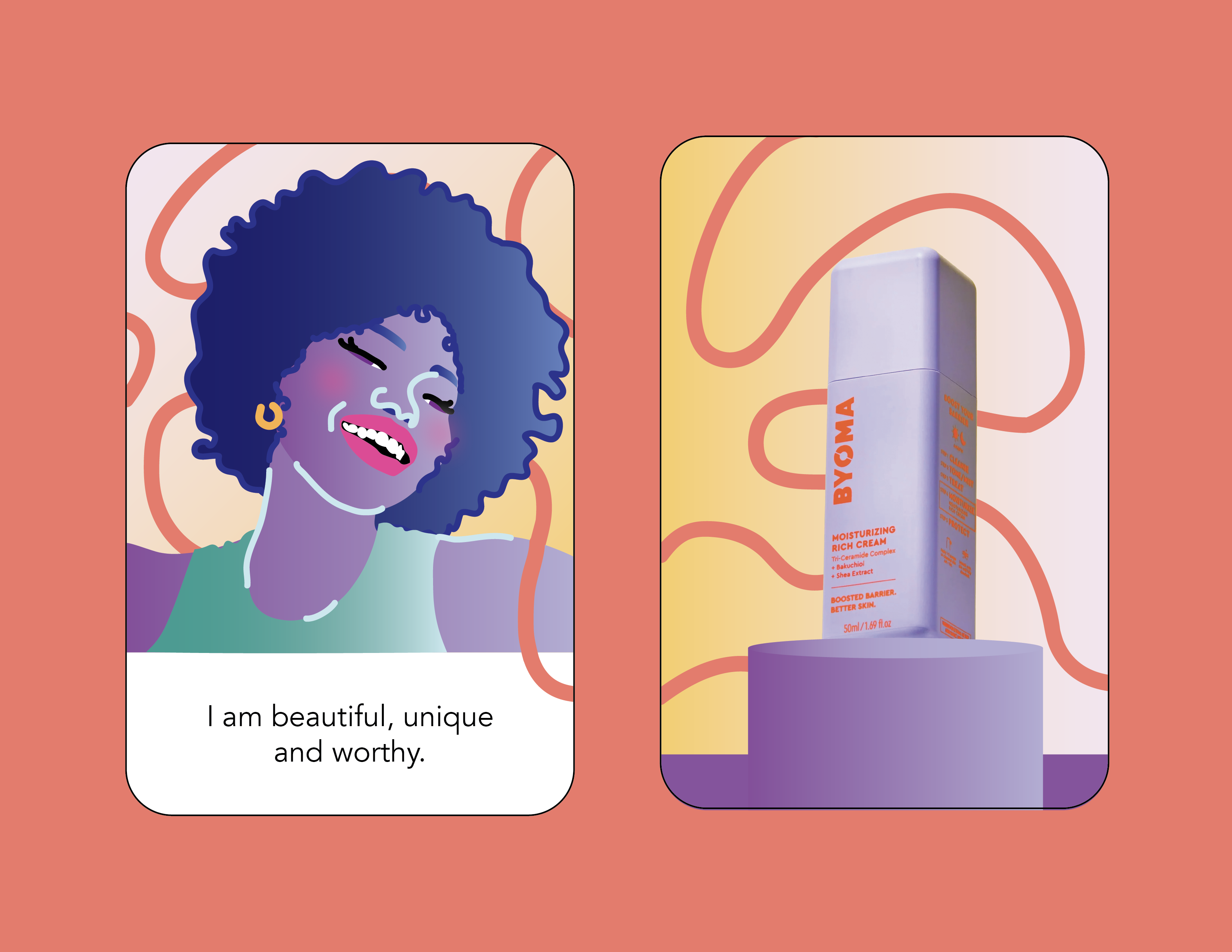
Illustrations: The illustrations are inspired by the models on BYOMA’s website and use intentionally vibrant forms to express diversity and humanity through a universal language—colour. Each character highlights “perfect imperfections” and a sense of contentment.
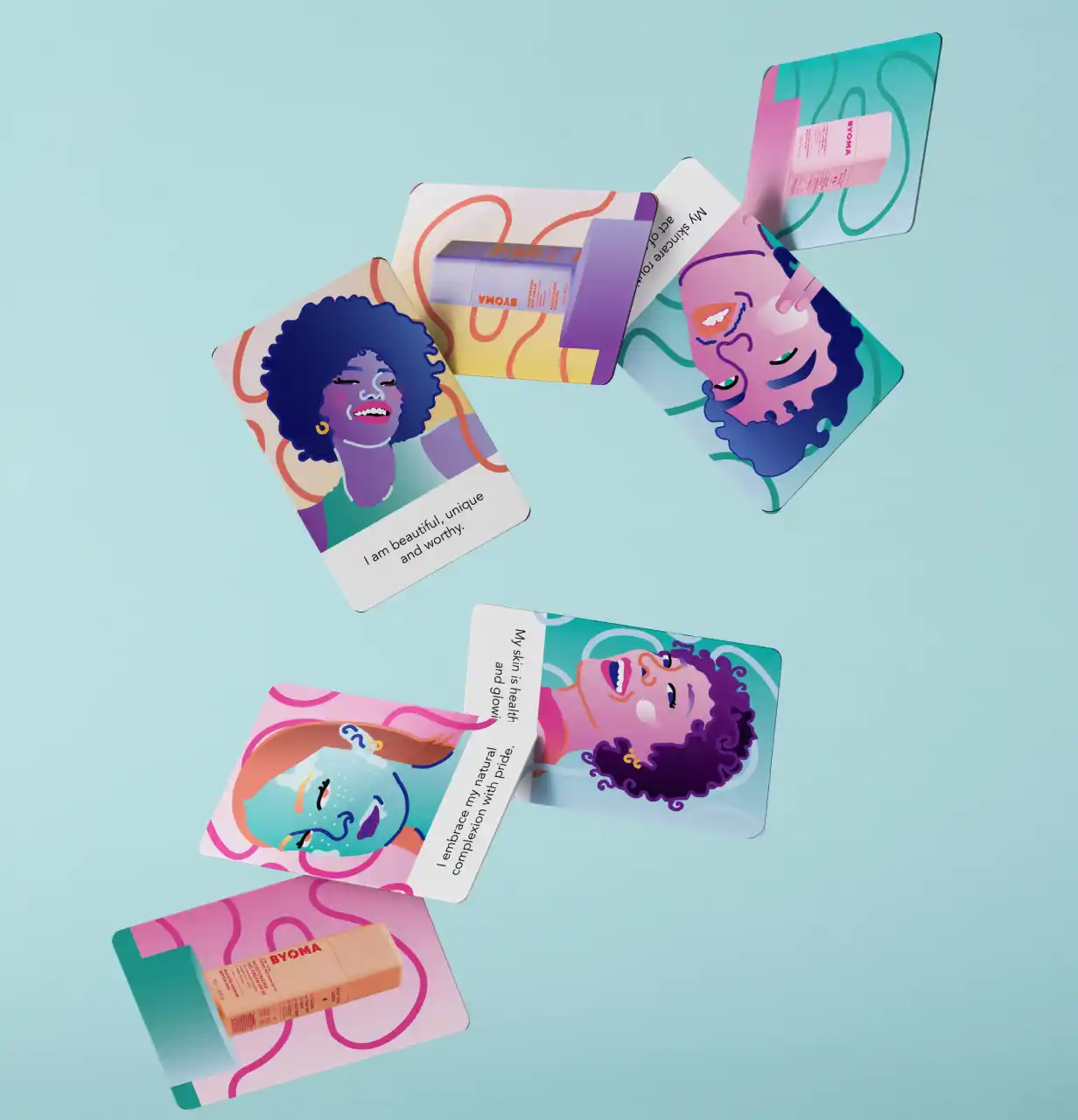
The design: On the front of each card, the affirmation is paired with a character illustration that embodies its meaning. On the back, a featured product connects directly to the affirmation, reinforcing its message through use and intention. The background design represents the fluidity of the products, adding movements because skincare isn’t static.
The Outcome
The dynamic design is a great way to market their product all while introducing a new facette of self-care and skin care. Innovation and marketing.
I had the opportunity to explore a new illustration style, which helped me expand my creative range and strengthen my visual storytelling. This project also allowed me to refine my design skills in creating cohesive, uplifting visuals that align with a brand’s message.
I rediscovered my love for branding and my skill for bringing out storytelling and inspiring the masses.


