TAINO Caribbean Music Festival
The Challenge
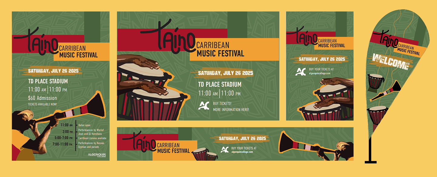
As a designer, I was tasked with creating the visual identity of this new festival in town, that includes colour schemes, illustration style, typography, hierarchy and overall coherence. Understanding what would draw in the target audience and speaking to them directly by creating functional communicating materials.
The Process
Colour & Pattern: The design is meant to be colourful and vibrant to reflect the islands and its music. The background consists of a pattern that is often seen in African, Native and Caribbean clothing, representing the different cultures that inhabit the islands.
The Imagery: Instruments, like drums and the lambis, are used as imagery for the design. I wanted to represent different traditional Caribbean instruments to emphasize that it’s not just one country. The three main colours; green, red, yellow are very tropical colours.
The Typography: I used DIN Condensed and Bad Grunge for the information. A bold sans serif helps the ad stand out, and the logo is built from custom lettering.
The Outcome
Throughout this project, I discovered my love for brand identity development and visual communication. I improved my layout design abilities by experimenting with colour, texture, and hierarchy to create a coherent flow next to the illustrations.
.webp)
.webp)
.webp)